
Key Notes
- Top: Pineapple, Bergamot
- Heart: Birch, Jasmine
- Base: Oakmoss, Musk
Why You’ll Love It
- Long-lasting, commanding scent
- Perfect for day or evening wear
- Inspired by a legendary, luxury fragrance


For maximum longevity, apply to pulse points: the inner wrists, base of the throat, and behind the ear lobes. Do not rub wrists together, as this breaks down the fragrance oils.
Alcohol Denat, Parfum (Fragrance), Aqua (Water), Limonene, Linalool, Citronellol. Free from parabens and phthalates.
Complimentary express shipping on premium orders. We offer a hassle-free 14-day return policy for unsealed boxes.




Graphic tees, hoodies and pop-culture apparel across different fandoms,
genres and limited-edition drops.
The catalogue was not the problem. The challenge was knowing which products
deserved attention right now.
A catalogue this large can make an account look busy very quickly.
But busy is not the same as well managed.
The account had three things working against it:
Strong designs and weak designs were often sharing the same budget, which made it harder for the real winners to break through.
Limited drops needed to be tested quickly. Waiting too long for perfect data meant missing the moment when interest was highest.
The real question was not:
“Which campaign performed best?”
It was:
“Which design, collection and fandom is actually earning more budget?”
Fresh products launched with enough budget to prove demand, without immediately being treated like guaranteed winners.
Products with repeatable purchase volume earned more spend and a longer life inside catalogue and evergreen activity.
Campaigns and creative were grouped around distinct themes instead of speaking to every pop-culture buyer in the same way.
Designs that failed to earn clicks, carts or purchases were removed before they consumed too much budget
Strong designs and weak designs were often sharing the same budget, which made it harder for the real winners to break through.
Horror, gaming, anime, retro and sci-fi buyers did not respond to the same creative, message or offer.
Limited drops needed to be tested quickly. Waiting too long for perfect data meant missing the moment when interest was highest.
Fresh products launched with enough budget to prove demand, without immediately being treated like guaranteed winners.
Products with repeatable purchase volume earned more spend and a longer life inside catalogue and evergreen activity.
Campaigns and creative were grouped around distinct themes instead of speaking to every pop-culture buyer in the same way.
Designs that failed to earn clicks, carts or purchases were removed before they consumed too much budget.
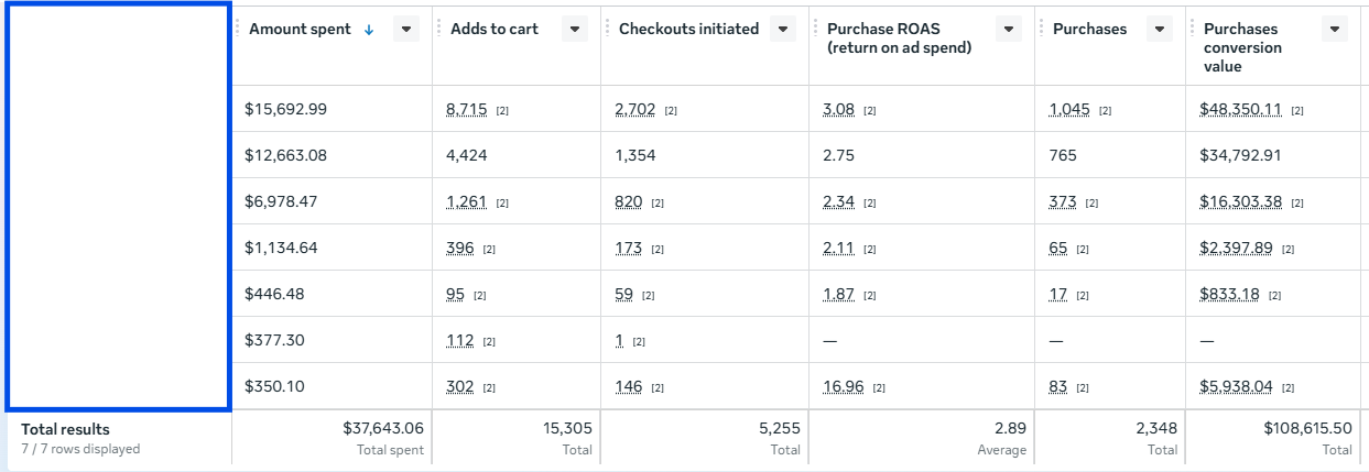
With a fast moving catalogue, the hardest part is not launching ads.
It is making product decisions quickly enough that good designs get room to grow and weak ones stop taking up budget.
The account worked better once paid media started behaving more like merchandising.
Premium coffee products for customers who cared about quality, taste and convenience. Getting consistent results was not the hard part, scaling it consistently was the real deal.
Some campaigns performed. Some didn’t. The bigger issue was that there wasn’t enough structure behind scaling with consistent returns.
The account had three things working against it:
Some campaigns performed. Some didn’t. The bigger issue was that there wasn’t enough structure behind scaling with consistent returns.
The campaigns were missing potential buyers outside the most obvious coffee-interest segments
There were enough campaigns running to learn from. The problem was that the account wasn’t consistently using those learnings to decide what to kill, what to keep and what deserved more money.
There were enough campaigns running to learn from.
The problem was that the account wasn’t consistently using those learnings to decide what to kill, what to keep and what deserved more money.
Interest groups, lookalikes and warmer audiences were tested separately instead of being bundled into the same structure.
New visuals, copy and offers were tested against clear controls so it was easier to see what was actually moving performance.
Landing-page and checkout friction was reviewed so the ad was not doing all the work only to lose the customer afterwards.
Some campaigns were barely breaking even, which made it difficult to know where more budget should go.
The campaigns were missing potential buyers outside the most obvious coffee-interest segments.
Increasing spend without knowing which audiences and messages were producing serious purchases only made the waste bigger.
Interest groups, lookalikes and warmer audiences were tested separately instead of being bundled into the same structure.
New visuals, copy and offers were tested against clear controls so it was easier to see what was actually moving performance.
Landing-page and checkout friction was reviewed so the ad wasn’t doing all the work only to lose the customer afterwards.
Winning campaigns earned more budget once they had enough data to prove they could handle the additional spend.
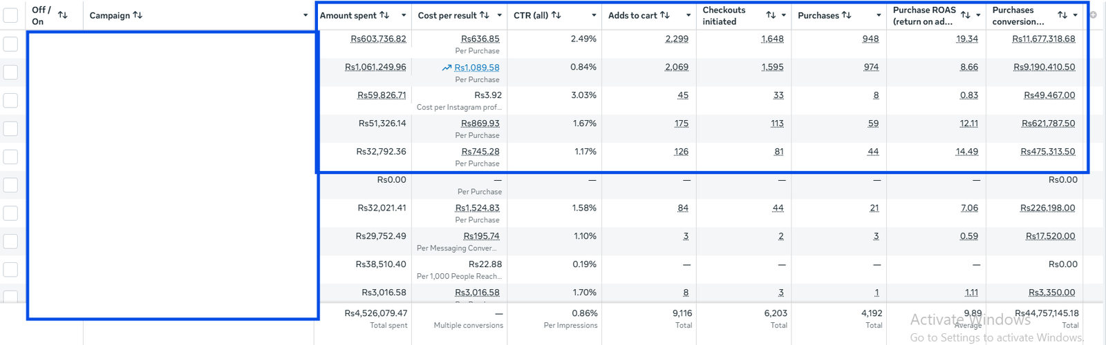
Meta helped create interest and bring the space into consideration.
Google handled a different job: capturing people already searching for
coffee, machinery and a potential partnership.
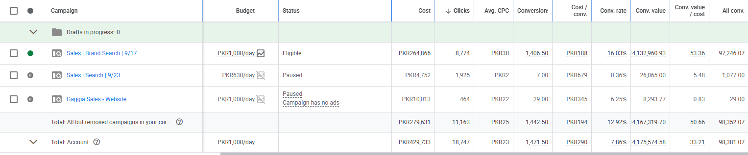
Scaling gets a lot easier once the account stops guessing.
The biggest improvement here wasn’t one “winning ad”. It was building a
system that made it obvious which campaigns deserved more budget and which
ones didn’t.
Residential properties in the United States with a unique offer. Challenge wasn’t convincing people that homes are interesting. It was finding the people who were actually in a position to buy one.
Real-estate ads can attract a lot of curiosity. Unfortunately, curiosity and buying intent are not the same thing. The account had three things working against it:
Real-estate ads can attract a lot of curiosity.
Unfortunately, curiosity and buying intent are not the same thing.
Budget was being spread across people with very different levels of intent, affordability and readiness.
It might mean: “I’m ready to book a viewing.” Or: “I like this kitchen and wanted the brochure.” The campaigns needed a better way to tell those people apart before the sales team spent time following up.
It might mean:
“I’m ready to book a viewing.”
Or:
“I like this kitchen and wanted the brochure.”
The campaigns needed a better way to tell those people apart before the sales team spent time following up.
The instant forms asked for useful information such as preferred location, budget, purchase timeline and financing status.
Ads highlighted location benefits, property features, payment flexibility and lifestyle value instead of relying on generic listing visuals.
Lead details were structured so serious prospects could be identified and contacted faster.
I rephrased their existing offer to look more attractive and pull in serious buyers.
Real-estate ads can attract a lot of curiosity. Unfortunately, curiosity and buying intent are not the same thing.
A large share of enquiries came from people browsing listings rather than actively planning a purchase.
Budget was being spread across people with very different levels of intent, affordability and readiness.
The offer was unique but not attractive enough to pull in serious buyers.
It might mean: “I’m ready to book a viewing.”
Or: “I like this kitchen and wanted the brochure.”
The campaigns needed a better way to tell those people apart before the sales team spent time following up.
The instant forms asked for useful information such as preferred location, budget, purchase timeline and financing status.
Ads highlighted location benefits, property features, payment flexibility and lifestyle value instead of relying on generic listing visuals.
Lead details were structured so serious prospects could be identified and contacted faster.
I rephrased their existing offer to make it more attractive and compelling, helping pull in prospects who were more serious about buying.
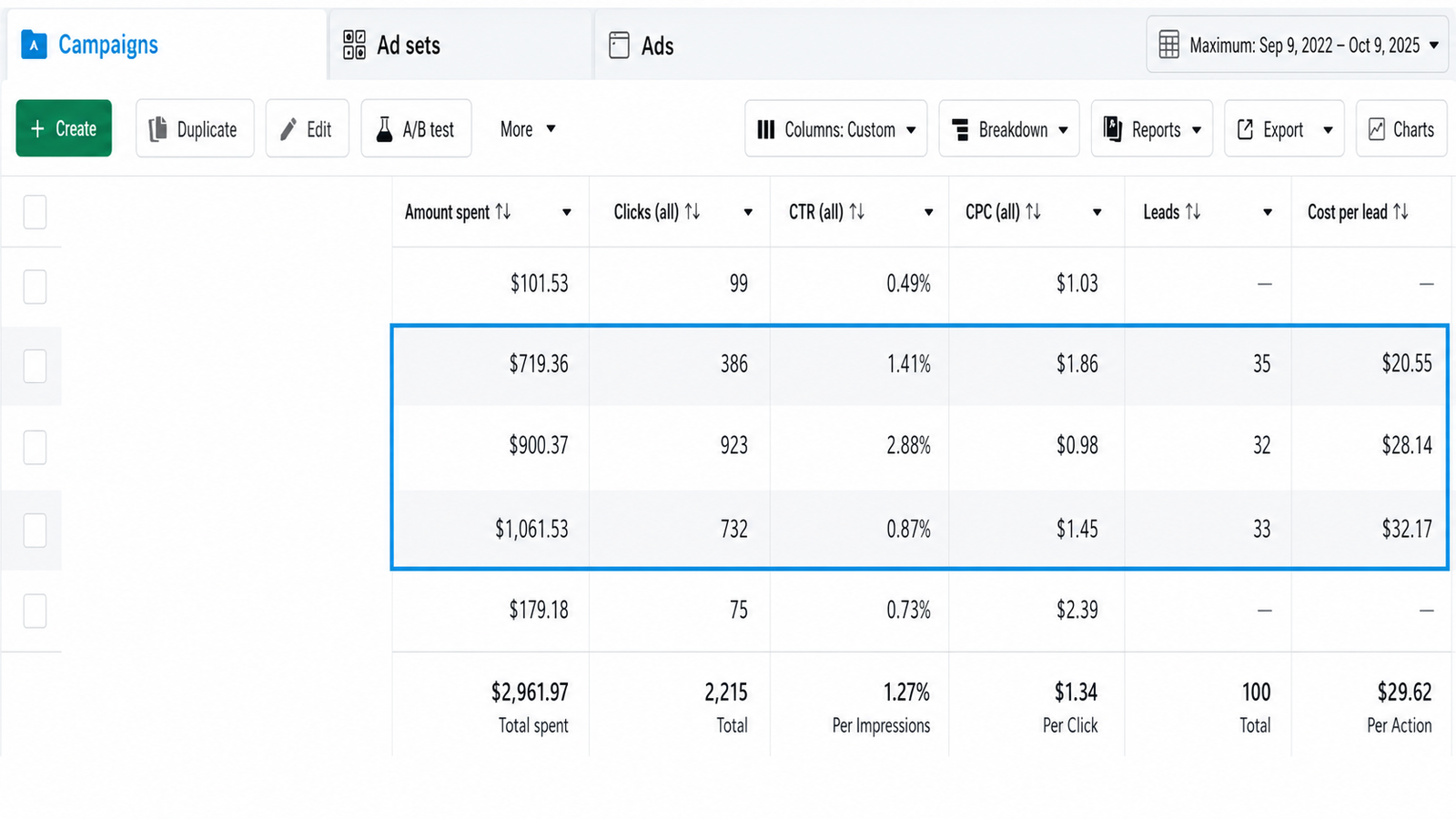
Real estate campaigns can generate leads very quickly when the form is easy
and the targeting is broad. That does not mean the sales team is getting
good opportunities.
The real improvement came from asking better questions, making the ads more
specific and being clearer about who the property was actually for.
Real-estate ads can attract a lot of curiosity. Unfortunately, curiosity and buying intent are not the same thing.
A large share of enquiries came from people browsing listings rather than actively planning a purchase.
Budget was being spread across people with very different levels of intent, affordability and readiness.
The offer was unique but not attractive enough to pull in serious buyers.
It might mean: “I’m ready to book a viewing.”
Or: “I like this kitchen and wanted the brochure.”
The campaigns needed a better way to tell those people apart before the sales team spent time following up.
The instant forms asked for useful information such as preferred location, budget, purchase timeline and financing status.
Ads highlighted location benefits, property features, payment flexibility and lifestyle value instead of relying on generic listing visuals.
Lead details were structured so serious prospects could be identified and contacted faster.
I rephrased their existing offer to make it more attractive and compelling, helping pull in prospects who were more serious about buying.
Real estate campaigns can generate leads very quickly when the form is easy and the targeting is broad. That does not mean the sales team is getting good opportunities.
The real improvement came from asking better questions, making the ads more specific and being clearer about who the property was actually for.
Wellness and skincare products including face serums, moisturisers, body oils and other self care essentials.
It was a crowded category, which meant looking “nice” was not enough. The ads needed a proper point of view.
Natural. Clean. Organic. Gentle. Premium.
None of those words are bad. The problem is that almost every wellness brand uses them.
The account had three things working against it:
Natural. Clean. Organic. Gentle. Premium. None of those words are bad. The problem is that almost every wellness brand uses them.
The same visual styles kept appearing, so performance gradually dropped as audiences saw more of the same.
A person who already understands the product may only need an offer or reminder. Someone seeing the brand for the first time needs more: the problem it solves, what’s inside it, how it fits into their routine and why it is worth trying. The account needed a better order of operations.
A person who already understands the product may only need an offer or reminder.
Someone seeing the brand for the first time probably needs a little more: the problem it solves, what is inside it, how it fits into their routine and why this product is worth trying.
The account needed a better order of operations.
The messaging moved away from generic wellness claims and focused more on product experience, ingredient quality, routines and the practical reason someone would use each item.
Lifestyle imagery, product close-ups, ingredient-led creatives, customer content and educational formats were rotated instead of relying on one visual style until it stopped working.
Cold audiences saw content that explained the product, the use case and the problem it solved before being pushed straight towards checkout.
Browsers saw education. Product viewers saw proof. Cart abandoners saw stronger reasons to finish the purchase
A person who already understands the product may only need an offer or reminder. Someone seeing the brand for the first time probably needs a little more.
They don’t know the product yet. They need context before they’re ready to make a decision.
They already understand the product. They may only need a stronger reason to complete the purchase.
The account needed a better order of operations.
The messaging moved away from generic wellness claims and focused more on product experience, ingredient quality, routines and the practical reason someone would use each item.
Lifestyle imagery, product close-ups, ingredient-led creatives, customer content and educational formats were rotated instead of relying on one visual style until it stopped working.
Cold audiences saw content that explained the product, the use case and the problem it solved before being pushed straight towards checkout.
Ad copy, targeting and landing page messaging were aligned with the areas the company actually served instead of treating the entire market as one audience.
The ads talked about ingredients and benefits, but not in a way that made the brand feel meaningfully different.
The same visual styles kept appearing, so performance gradually dropped as audiences saw more of the same.
Some products needed explanation: What does it do? Who is it for? How do you use it? Why trust it?
They don’t know the product yet. They need context before they’re ready to make a decision.
They already understand the product. They may only need a stronger reason to complete the purchase.
The messaging moved away from generic wellness claims and focused more on product experience, ingredient quality, routines and the practical reason someone would use each item.
Lifestyle imagery, product close-ups, ingredient-led creatives, customer content and educational formats were rotated instead of relying on one visual style until it stopped working.
Cold audiences saw content that explained the product, the use case and the problem it solved before being pushed straight towards checkout.
Browsers saw education. Product viewers saw proof. Cart abandoners saw stronger reasons to finish the purchase.
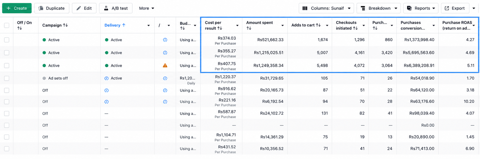
In a crowded category, vague language gets expensive.
People do not need another brand telling them a product is “natural.” They need to understand what it does, why it is relevant to them and why this version is worth choosing.
Once the ads started answering those questions properly, the numbers followed.
Flexible offices and coworking space in the UK for freelancers, small teams and growing businesses.The product itself was good. The harder part was getting the right people through the door to actually see it.
On paper, the lead volume looked respectable. In practice, too many people had little intention of booking a tour or taking a workspace.
On paper, the lead volume looked respectable. In practice, too many people had little intention of booking a tour or taking a workspace.
Flexible workspace” is vague. The campaigns needed to show why this particular space was worth seeing in person.
The business did not make money because someone filled in a form.
It made money when the right person booked a tour, liked the space and moved in. So the campaigns needed to optimise for intent.
The business did not make money because someone filled in a form. It made money when the right person booked a tour, liked the space and moved in. So the campaigns needed to optimise for intent, not just random names in a spreadsheet.
Targeting focused more heavily on business owners, professionals and people actively looking for workspace solutions.
Cold audiences saw the space and its benefits first. Warmer audiences were pushed towards booking a tour once they had shown interest.
Budgets increased gradually behind the campaigns producing serious enquiries, rather than spreading spend evenly across everything.
The business did not make money because someone filled in a form. It made money when the right person booked a tour, liked the space and moved in.
The campaigns needed to optimise for intent, not just random names in a spreadsheet.
Targeting focused more heavily on business owners, professionals and people actively looking for workspace solutions.
Business Owners
Professionals
Cold audiences saw the space and its benefits first. Warmer audiences were pushed towards booking a tour once they had shown interest.
Broad audiences were bringing in people who liked the idea of coworking, but weren’t actively looking for a desk or office.
“Flexible workspace” is vague. The campaigns needed to show why this particular space was worth seeing in person.
Increasing spend without knowing which audiences and messages were producing serious enquiries only made the waste bigger.
Targeting focused more heavily on business owners, professionals and people actively looking for workspace solutions.
Instead of generic coworking language, the creative highlighted practical reasons to book: location, flexibility, privacy, facilities and the quality of the space.
Cold audiences saw the space and its benefits first. Warmer audiences were pushed towards booking a tour once they had shown interest.
Budgets increased gradually behind the campaigns producing serious enquiries, rather than spreading spend evenly across everything.
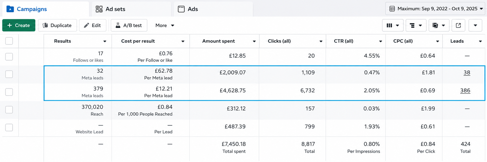
Meta helped create interest and bring the space into consideration. Google handled a different job: capturing people already searching for offices, coworking space and flexible workspace nearby.
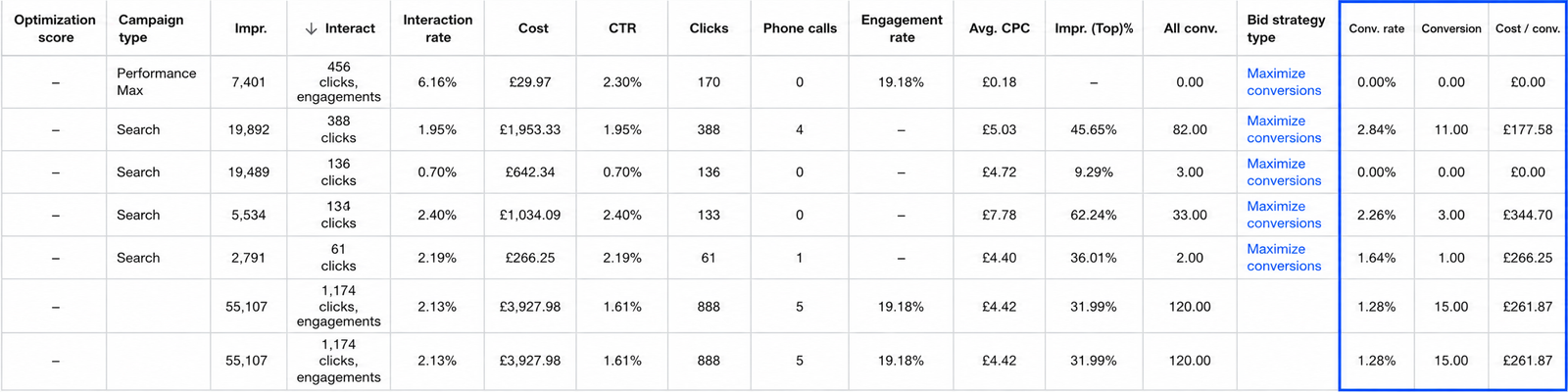
Cheap leads are not especially useful when nobody wants to visit. For a coworking space, the real job of the ads is to get the right person curious enough to step inside. Once the campaigns were built around that, the lead volume made a lot more sense.
Home remodelling services across the US, kitchens, bathrooms and larger renovation projects. These aren’t impulse purchases. People compare contractors, check reviews, look for licences and take their time.
Getting traffic wasn’t especially difficult. Getting the right homeowners at the right time was the harder part. The account had three things working against it:
Getting traffic wasn’t especially difficult. Getting the right homeowners at the right time was the harder part.
Someone searching “kitchen design ideas” and someone searching “kitchen remodelling contractor near me” may both click an ad. Only one of them is giving you a strong reason to believe they’re ready to speak.
Someone searching “kitchen design ideas” and someone searching “kitchen remodelling contractor near me” may both click an ad. Only one of them is giving you a strong reason to believe they’re ready to speak. The account needed fewer vague signals and more focus on people showing actual project intent.
Google campaigns focused more heavily on local, service specific searches with clear commercial intent. Broad terms were reduced, and irrelevant searches were filtered through negative keywords.
Ad copy, targeting and landing page messaging were aligned with the areas the company actually served instead of treating the entire market as one audience.
Website visitors, engaged users and relevant lookalikes gave Meta stronger signals than broad home improvement interests alone.
Someone searching “kitchen design ideas” and someone searching “kitchen remodelling contractor near me” may both click an ad.
The account needed fewer vague signals and more focus on people showing actual project intent.
Google campaigns focused more heavily on local, service-specific searches with clear commercial intent. Broad terms were reduced, and irrelevant searches were filtered through negative keywords.
Ad copy, targeting and landing page messaging were aligned with the areas the company actually served instead of treating the entire market as one broad audience from the start.
Google campaigns focused more heavily on local, service-specific searches with clear commercial intent. Broad terms were reduced, and irrelevant searches were filtered through negative keywords.
Ad copy, targeting and landing page messaging were aligned with the areas the company actually served instead of treating the entire market as one audience.
Generic home improvement keywords attracted people looking for ideas, tutorials or DIY products instead of someone ready to hire a contractor.
Targeting anyone interested in home improvement sounds sensible until a large chunk of the audience is there for décor inspiration rather than an actual renovation.
A remodelling project involves money, disruption and risk. Without proof, warranties, reviews and completed work, prospects have plenty of reasons to hesitate.
Google campaigns focused more heavily on
local, service-specific searches
with clear commercial intent. Broad terms were
reduced, and irrelevant searches were filtered
through negative keywords.
Ad copy, targeting and landing page messaging
were aligned with the areas the company
actually served instead of treating the
entire market as one audience.
Website visitors, engaged users and relevant
lookalikes gave Meta stronger signals than
broad home improvement interests alone.
Before-and-after work, customer reviews,
warranties, licences and service guarantees
became part of the message instead of
information people had to hunt for later.
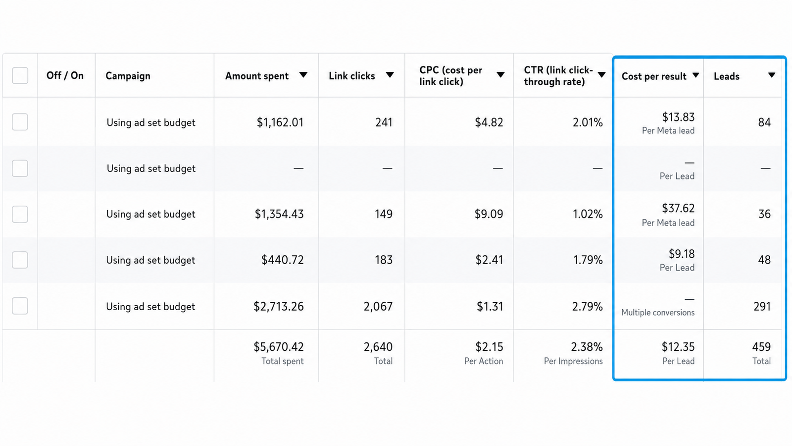
Meta helped reach homeowners before they necessarily started searching.
Google focused on the people already typing in the service they needed, which meant the keywords, location and search intent had to be much tighter.
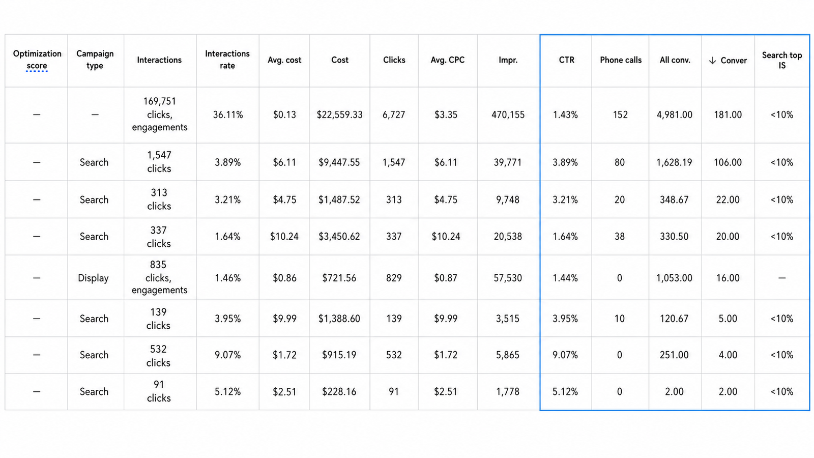
Home services advertising gets expensive very quickly when the targeting is vague.
“Interested in home improvement” is not the same thing as “owns a home, needs a contractor and is ready to talk.”
The closer the campaigns got to that second person, the better the account performed.
Premium baby & toddler products, the kind of stuff parents actually think about before buying.
High ticket products, new brand in the market, customers who needed more reassurance than “here’s an ad, now buy.
A faith-based ecommerce brand selling apparel, rosaries, jewellery and accessories to a pretty specific audience. And that specificity was both the advantage and the problem.
People were making it surprisingly far into the journey. They’d browse products, add to cart and even begin checkout.
Then a chunk of them disappeared. The account had three things working against it:
People were making it surprisingly far into the journey. They’d browse products, add to cart and even begin checkout. Then a chunk of them disappeared.
Go too broad and budget gets wasted. Go too narrow and you run out of new parents very quickly.
Someone adding a premium product to cart is already giving a strong signal. I didn’t need to keep convincing from scratch. I needed to get better at separating new shoppers from high-intent visitors & give each a different reason to move.
Someone adding a premium baby product to cart is already giving you a pretty strong signal. I didn’t need to keep convincing everyone from scratch. I needed to get better at separating new shoppers from high-intent visitors and give each group a different reason to move.
I stopped treating everyone who interacted with the brand as one big audience with the same buying intent and behavior.
Some people were there for the content. Some were browsing. Some had shown actual purchase intent.
Those people shouldn’t see the same ads, and they definitely shouldn’t get the same share of the budget.
Rosaries, apparel and accessories got their own campaigns, messaging and budgets instead of fighting inside one generic setup.
Engagement audiences were useful for building familiarity. Purchase-focused campaigns were reserved for people showing stronger buying signals.
Prospecting focused on audiences that actually looked like potential buyers, rather than simply anyone who happened to be a parent.
Someone who watched a video got treated differently from someone who added a product to cart or started checkout.
Campaigns weren’t built around one bestseller forever. Accessories, complementary products and bundles created more opportunities to increase the value of each customer.
A faith-based ecommerce brand selling apparel, rosaries, jewellery and accessories to a pretty specific audience. And that specificity was both the advantage and the problem.
Religious content naturally gets likes, comments and shares. Great for community. Not automatically great for revenue.
You can burn through the obvious interests pretty quickly.
Someone buying a hoodie does not necessarily shop like someone buying a rosary.
A person liking a quote is not necessarily looking to buy anything.
Rosaries, apparel and accessories got their own campaigns, messaging and budgets instead of fighting inside one generic setup.
Engagement audiences were useful for building familiarity. Purchase-focused campaigns were reserved for people showing stronger buying signals.
Past purchasers, email lists and engaged users helped build lookalikes, while adjacent interests gave the account room to grow beyond the obvious faith-based audiences.
Focused on purchase intent signals, not just likes and engagement, to guide budget, creative and campaign decisions.
Someone adding a premium baby product to cart is already giving you a pretty strong signal.
I didn’t need to keep convincing everyone from scratch. I needed to get better at separating new shoppers from high-intent visitors and give each group a different reason to move.
Prospecting focused on audiences that actually looked like potential buyers, rather than simply anyone who happened to be a parent.
Someone who watched a video got treated differently from someone who added a product to cart or started checkout.
Testimonials, product proof and clearer reasons to buy helped reduce some of the hesitation around purchasing higher-value baby products online.
Campaigns weren’t built around one bestseller forever. Accessories, complementary products and bundles created more opportunities to increase the value of each customer.
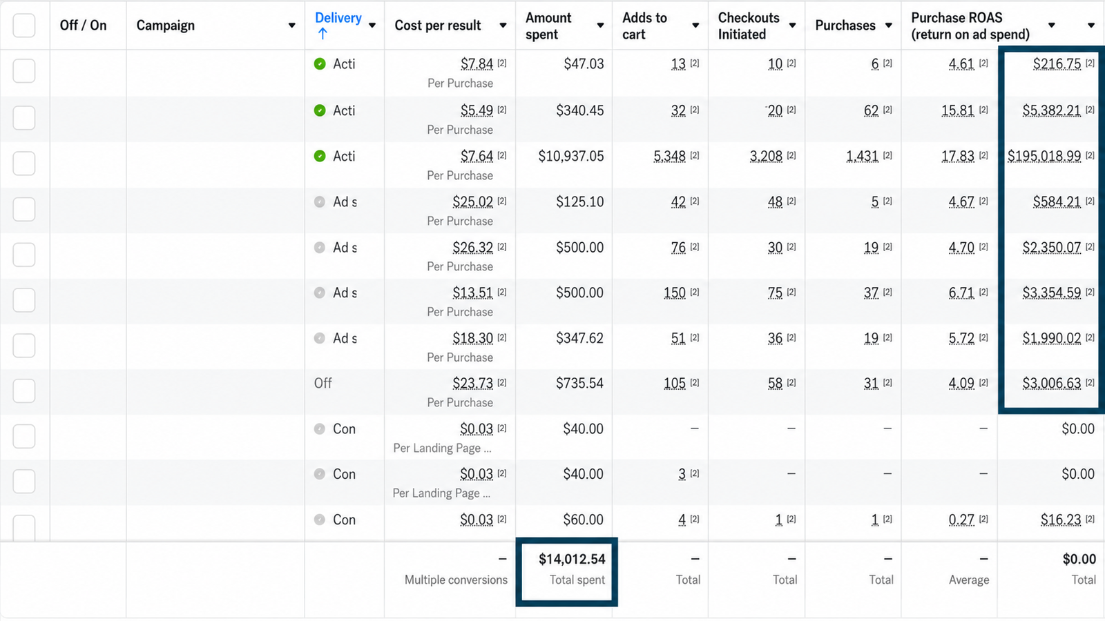
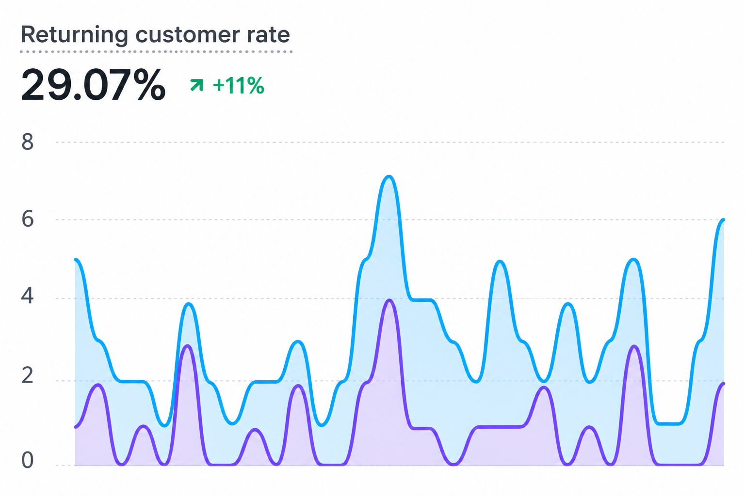
Acquisition gets most of the attention in paid media, but a customer who comes back is worth a lot more than a one-off conversion.
Returning customer rate reached 29.07%, up 111% over the comparison period.
Sometimes the answer isn’t “get more traffic.”
This account already had people raising their hands. The bigger opportunity was figuring out who was closest to buying, removing some of the hesitation, and putting more budget behind the campaigns that proved they could convert.
A faith-based ecommerce brand selling apparel, rosaries, jewellery and accessories
to a pretty specific audience. And that specificity was both the advantage and the
problem.
Religious content naturally gets likes, comments and shares. Great for community. Not automatically great for revenue.
I stopped treating everyone who interacted with the brand as one big audience. Some people were there for the content. Some were browsing. Some had shown actual purchase intent.
Rosaries, apparel and accessories got their own campaigns, messaging and budgets instead of fighting inside one generic setup.
Engagement audiences were useful for building familiarity. Purchase-focused campaigns were reserved for people showing stronger buying signals.
Past purchasers, email lists and engaged users helped build lookalikes, while adjacent interests gave the account room to grow beyond the obvious faith-based audiences.
Product ads, testimonials, discounts and reminders went back to people who had already given us a reason to believe they might buy.
Rosaries, apparel and accessories got their own campaigns, messaging and budgets instead of fighting inside one generic setup.
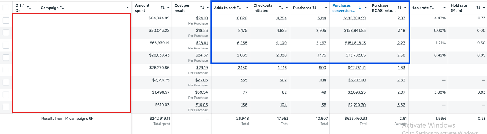
Meta handled discovery, demand generation and retargeting. Google gave us another way to capture people already searching with intent.

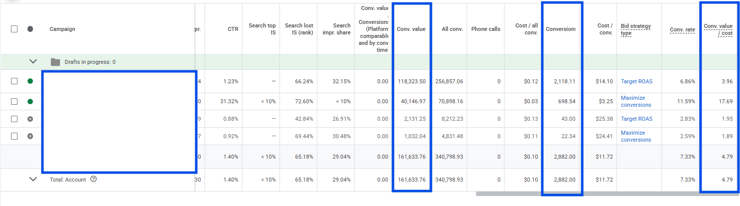
Niche audiences don’t always need more targeting. Sometimes they need better separation.
And high engagement is only impressive when you know what role it’s meant to play.